OAK: Amazing Wood Floor
Year: 2022
Client: OAK
Category: Branding, Promotion, Digital
THE BEAUTY OF THE NATURAL
#Branding
In Provence, France, on the shores of the Mediterranean Sea, exists a small town surrounded by forests called Fréjus. From there, we got a call from Guillaume, the head of OAK, a company that has been handcrafting natural floors from real wood for generations. The challenge he proposed to us was to professionalize all the brand’s communication and enter the digital world, where they only had a testimonial presence, giving it a similar approach to the world of ceramics, taking advantage of our extensive experience in the field.
When we received a package from Fréjus with all their products, we were surprised by the quality and natural appearance of their woods, and we had no doubt that this would be the strategic axis of the whole project: to maintain the artisan and natural essence of the brand and to give all the prominence to the product.
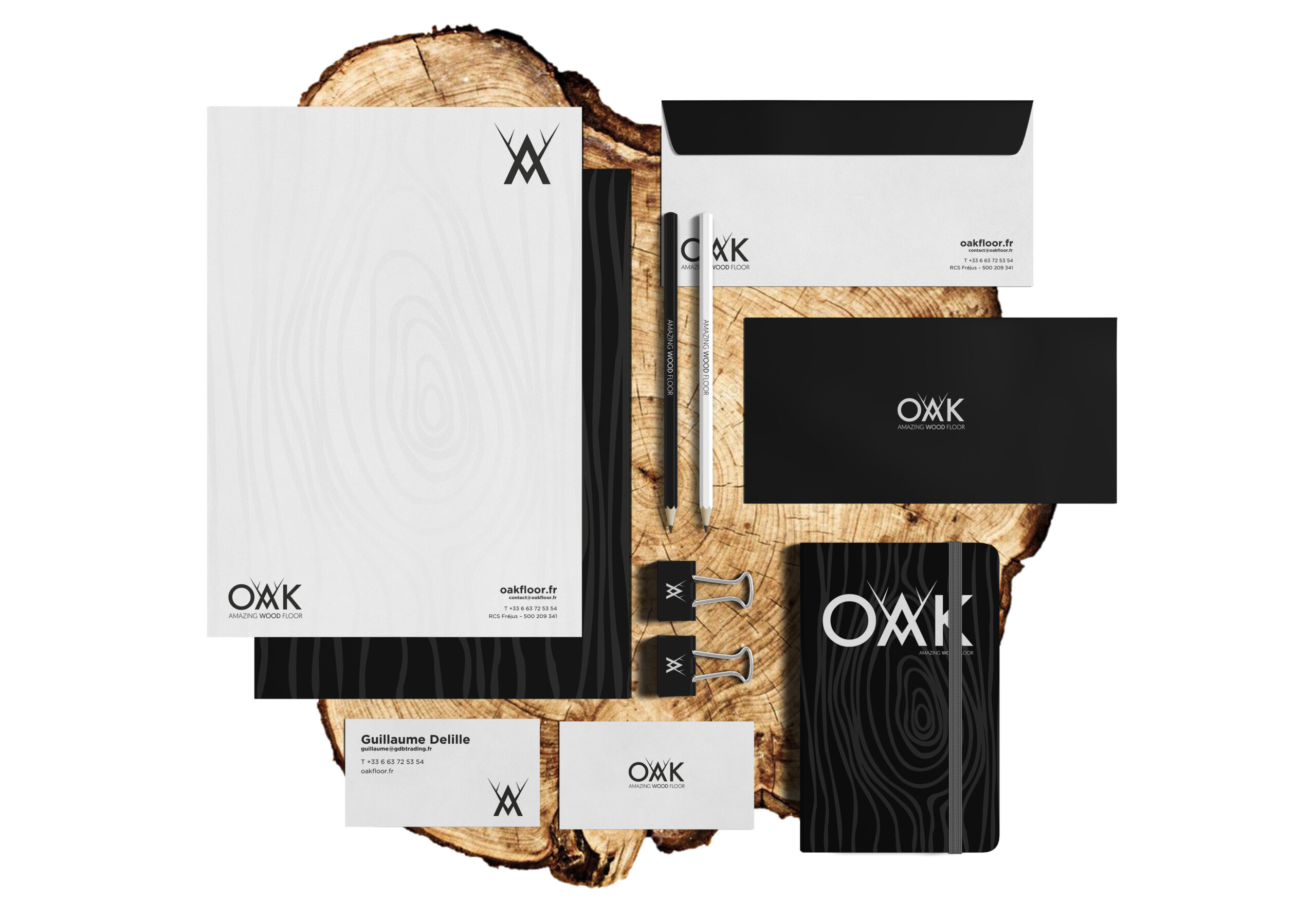
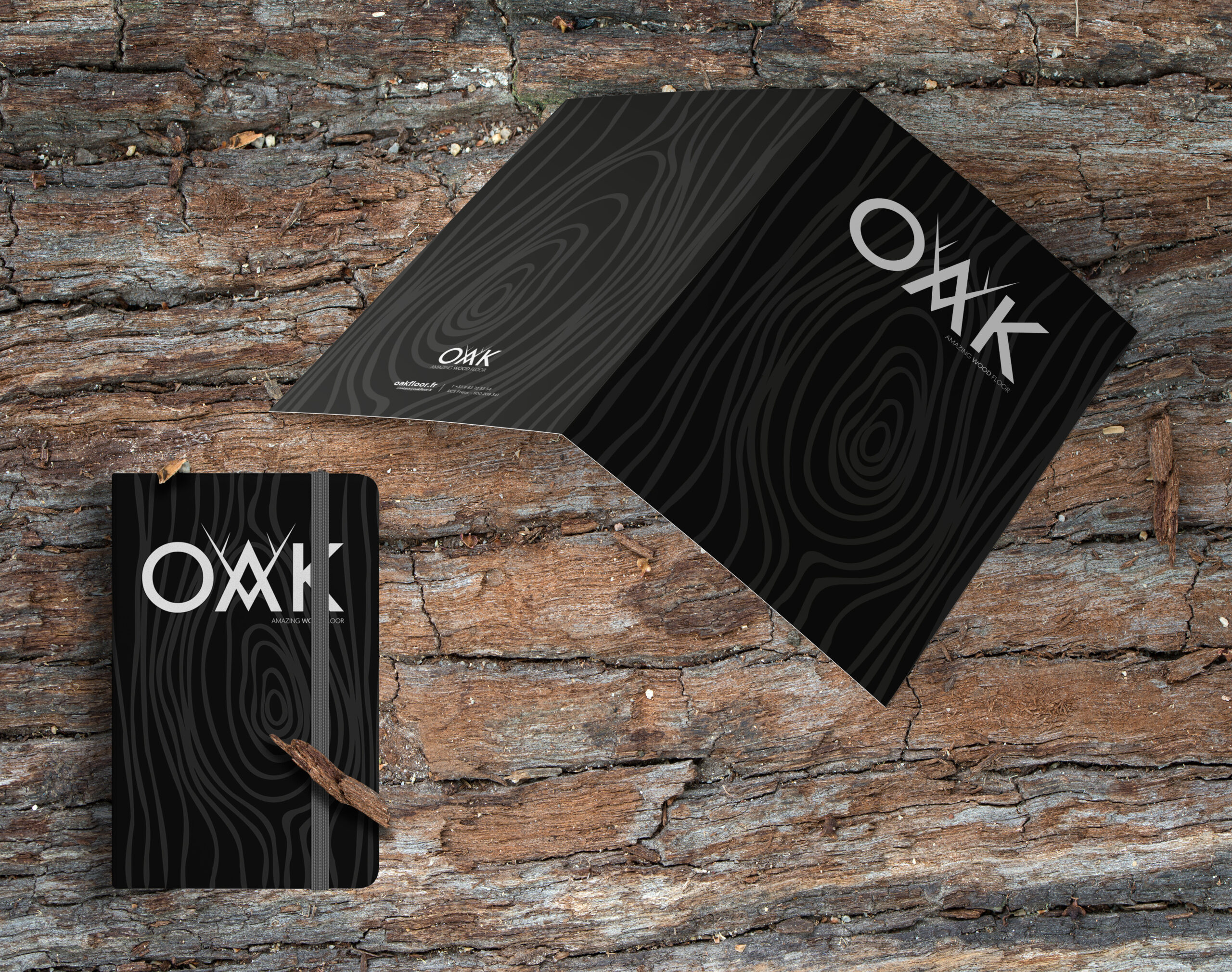
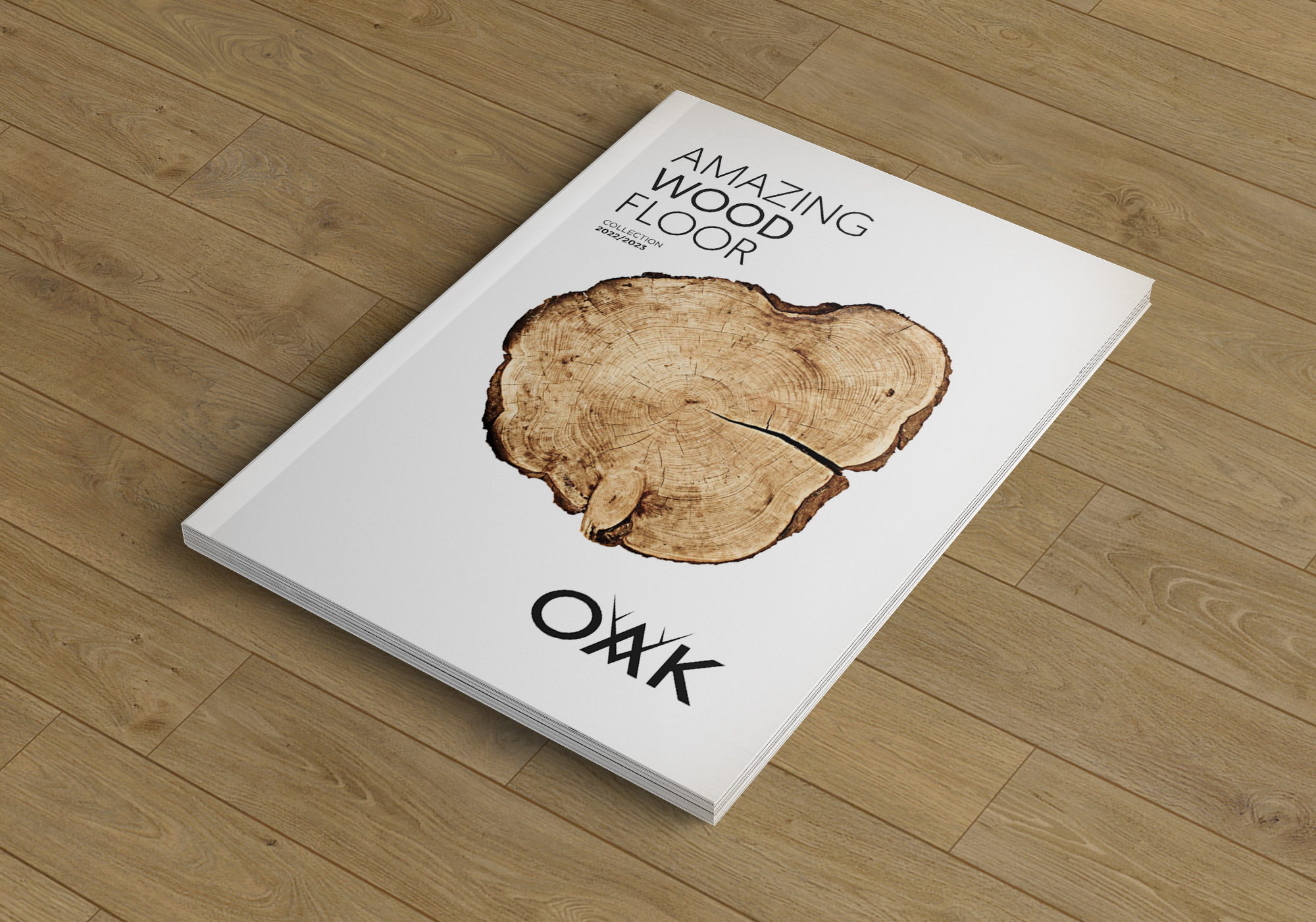
The first thing we did was to completely renew the brand and its entire corporate identity. To do this we used black and white, a basic chromatic range, which would allow us a great contrast with the warm and vivid colours of its wood, and thus achieve a greater prominence of the product. We renewed the logo, maintaining the essence of the old one, and incorporated the claim AMAZING WOOD FLOOR, with the international market in mind. Minimalist stationery and packaging completed this part of the project.
ORDER MATTERS
#Promotion
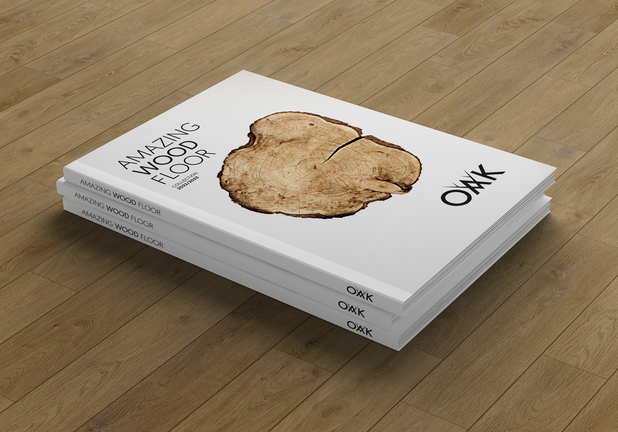
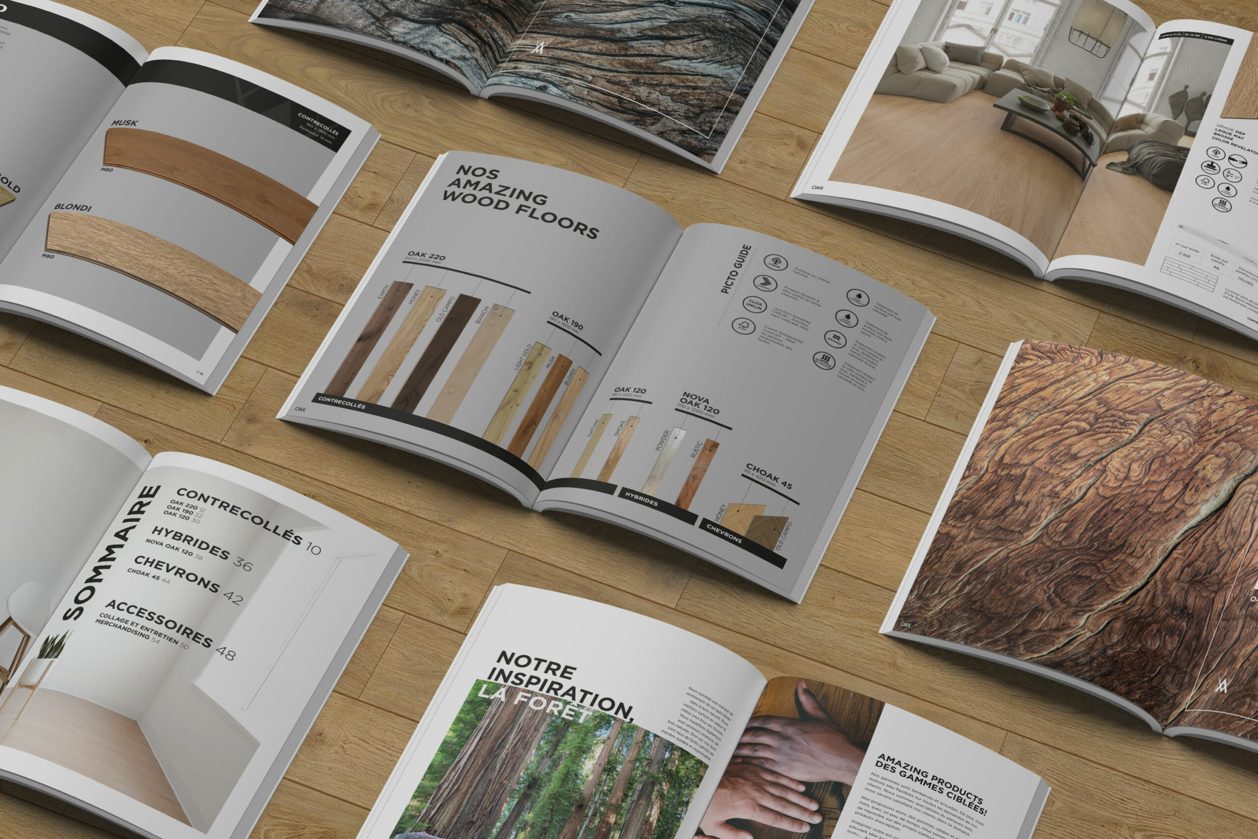
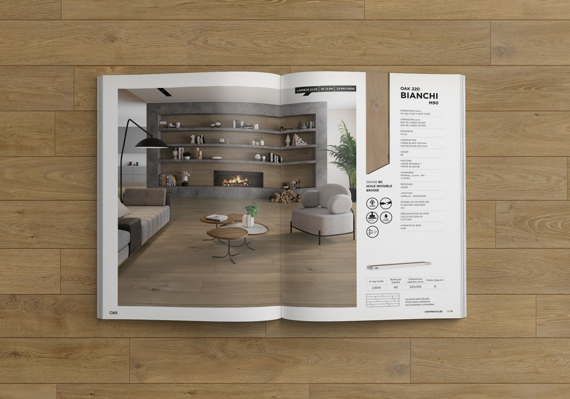
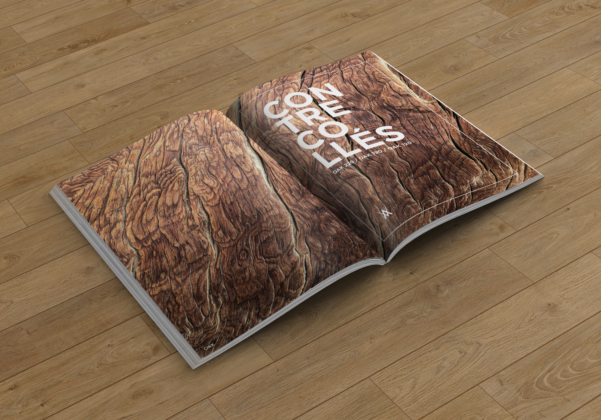
At Mibalia, the first step we take when we start creating a product catalogue is to understand the extent of the catalogue and the elements that make it up. Once we have analysed this, we put ourselves in the user’s shoes and define what experience we want them to have when they consult the catalogue. In the case of OAK, we realised that they had a very small number of products, but that they could confuse the user due to the similarity of the nomenclature, possibly leading them to confuse the difference between the different product groups.
So we designed the catalogue around a summary sheet of all their products to scale, where at a glance the user knew which products there were, which group they belonged to, their measurements and the finishes available. Once this was done, it was much easier to understand the series of product sheets in the rest of the catalogue, which had an environment for each reference. These environments were carefully created by our architecture department, faithfully reproducing the warmth and tone of the wood.
AMAZING WOOD WEB
#Digital
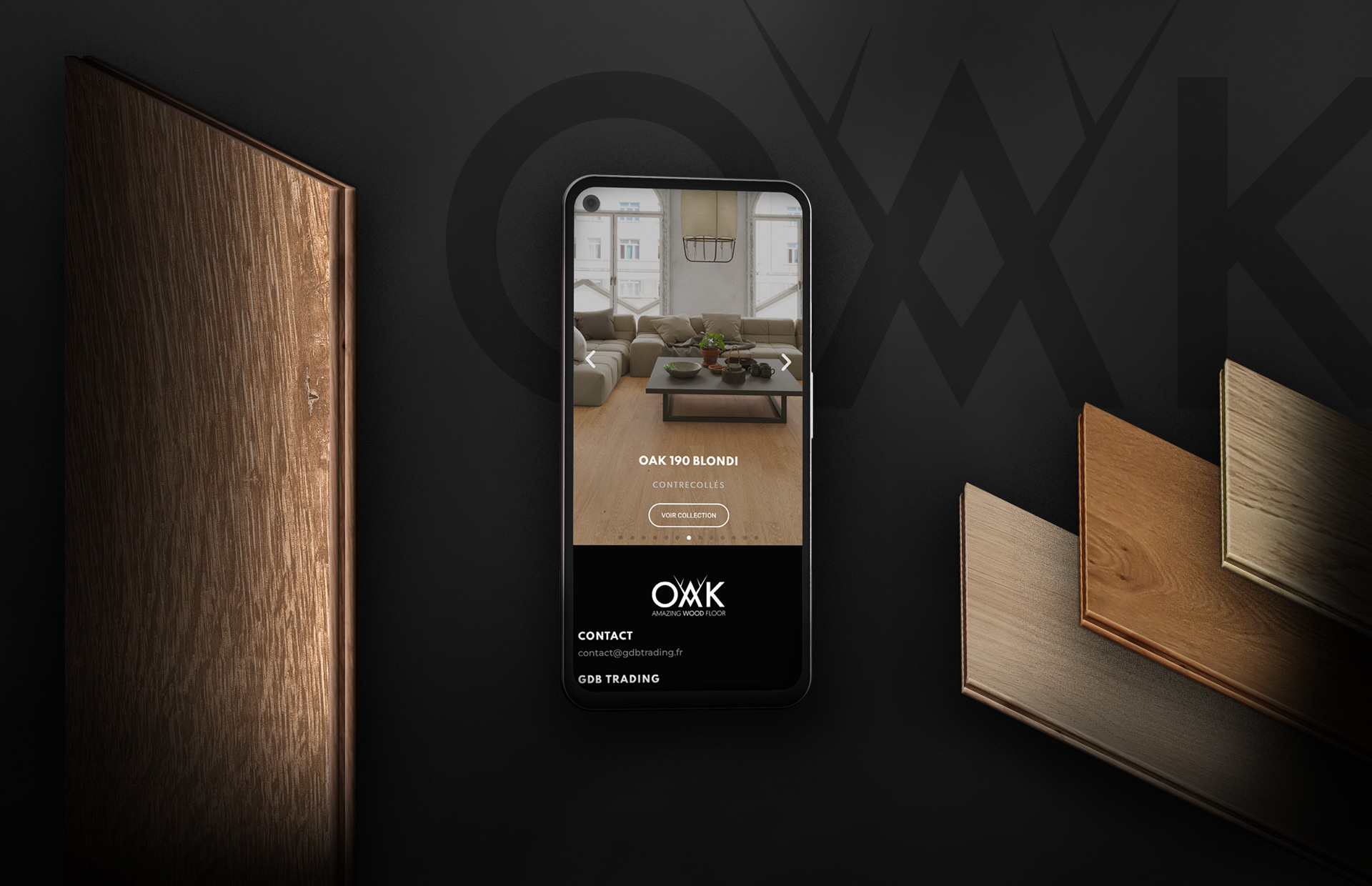
The first element we designed for the new website was an audiovisual that reinforced the natural and artisan message of OAK woods. A journey from the depths of the forests to the floor of our home, passing through the different stages of manufacture.
The website was built keeping the black and white chromatic range of the brand and the catalogue, which contrasted perfectly with close-ups of the vivid and colourful textures of the woods. This, together with the audiovisual, was different from the usual technical and cold aspect of ceramic websites, making the user capable of feeling the woods in their web experience.
In terms of the structure of the site, it was very important for the user to have access to any product in the catalogue from the home page, and for it to be very accessible to carry out any action from anywhere on the web. Once again, we applied the «mobile first» concept, and a careful adaptation to tablet and desktop.
